Ona Canggu
Restaurant
Project Details
March 2019
Deliverables
Brand Identity & Development / Brand Asset – Print & Digital
Ona is a provencal-influenced eatery with its own vegetable garden supported by an open air dining setting up a perfect scene to be engulfed by great food and nature.
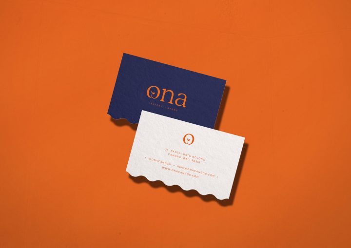
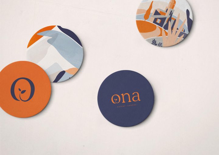
Colors of the earth and sky with an organic element of graphics are used to harness the soul of Ona. The logotype uses a friendly serif typeface which has a free flow edge to it, and in the logogram we use the letter O that represents a circle of life and a plant growing up at the end of the letter or from another perspective from the earth to highlight the organic, farm to table unique selling point of Ona.
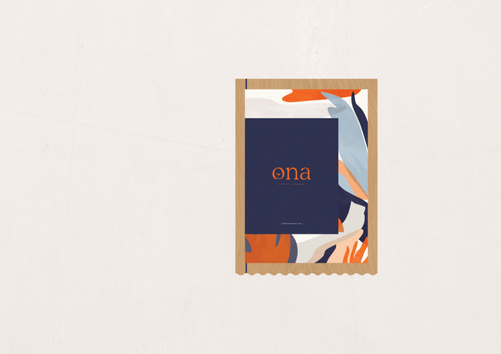
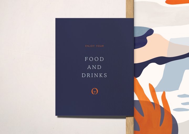
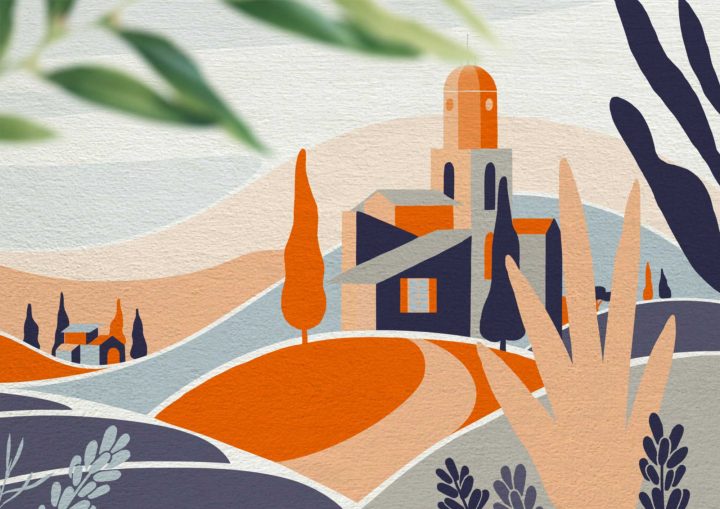
The illustration is a picture depicting a simple life on the hills. A disperse of healthy lands giving birth to an array of plants and trees, a gradient of blue skies out in the open, inspiring a joyful agricultural lifestyle of growing your own food accompanied and surrounded by the beautiful nature. These are all the inspiration of how Ona came about, wonderfully integrated into the branding.
