Nofilter
Product
Project Details
March 2019
Deliverables
Creative & Art Direction / Brand Asset – Print & Digital
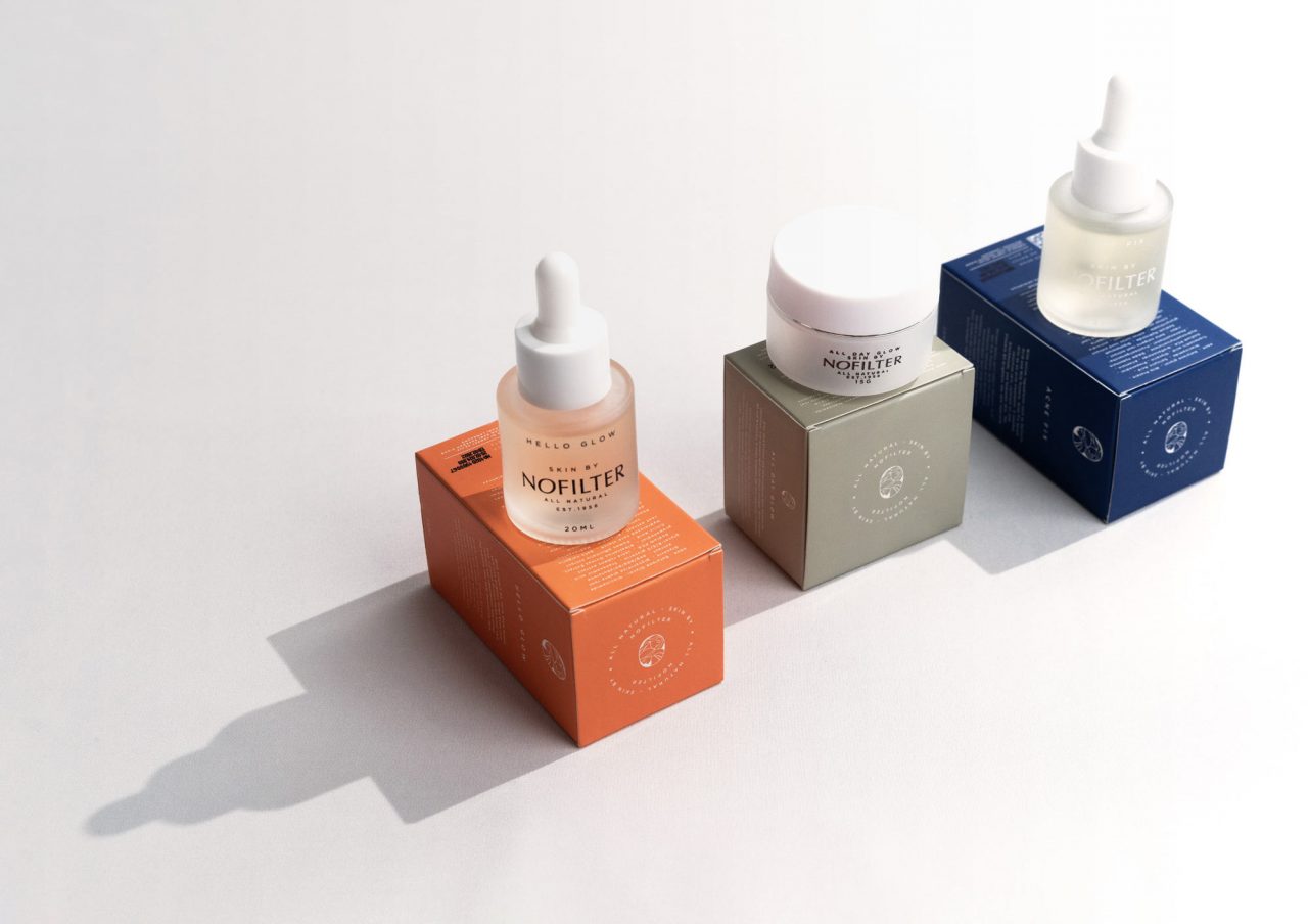
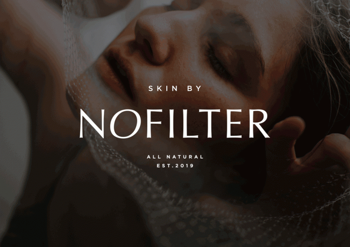
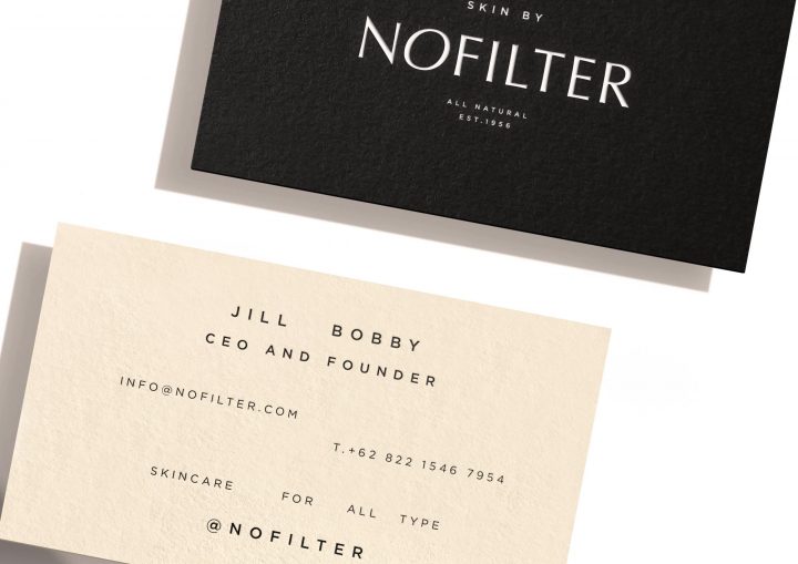
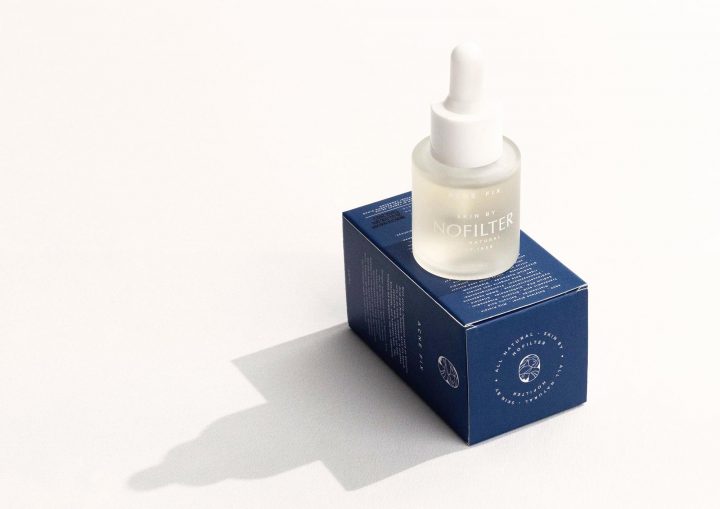
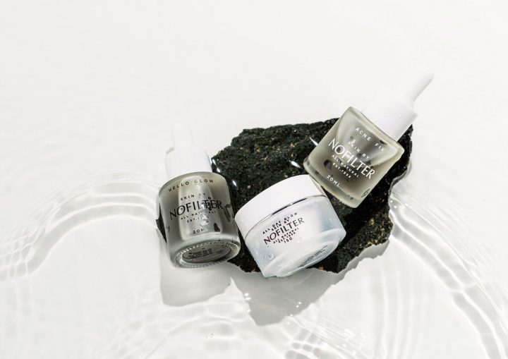
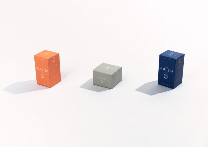
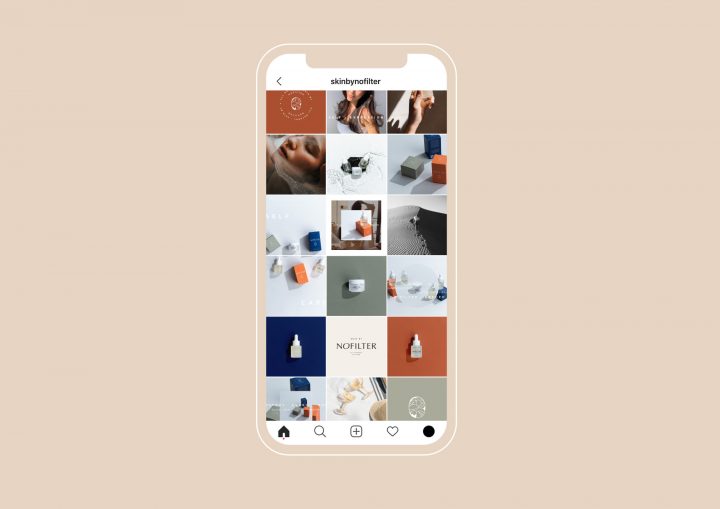
Merillangie empowering Nofilter through Creative and Art Direction – Interesting branding can be paradoxical sometimes and that is the case with Nofilter. With a premium target market and a humble background story. We made down to earth luxury the very essence of the brand.
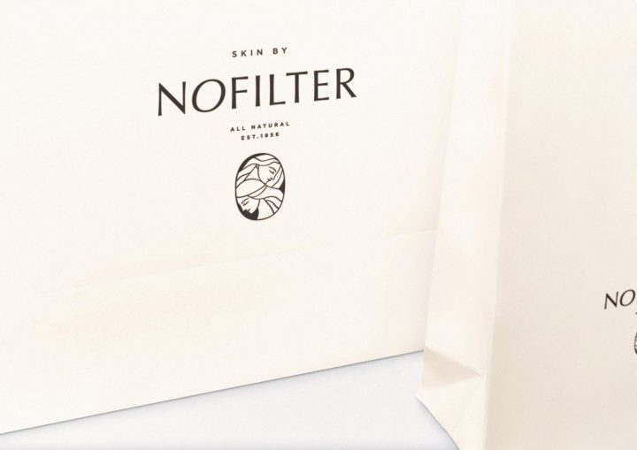
First, the logotype, a custom made minimal type with an organic twist to highlight the modern yet natural feel.
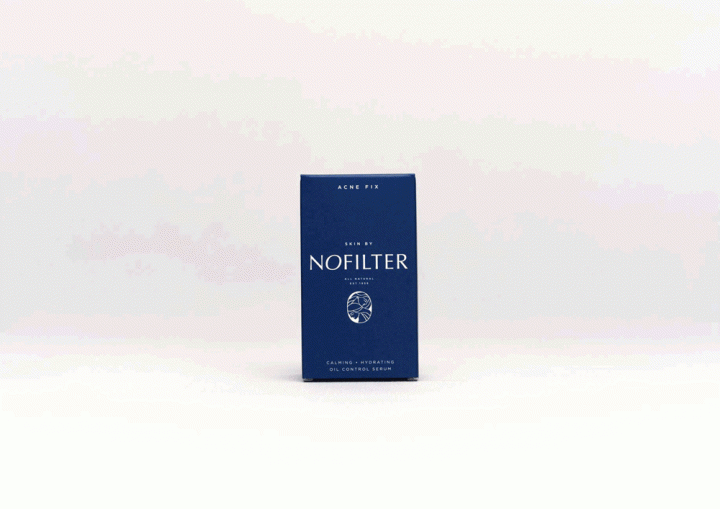
In addition, the icon of two women representing the mother & grandmother whom inspired the beginnings of the brand and invented the recipes for the natural skincare. Most importantly, it symbolises femininity and elegance, narrating that natural skincare is not just a lifestyle but also a long carried habitual tradition.
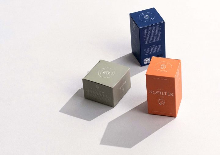
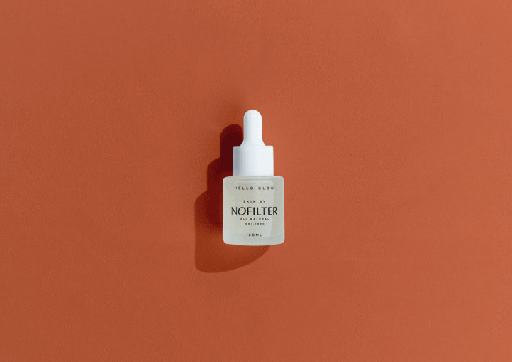
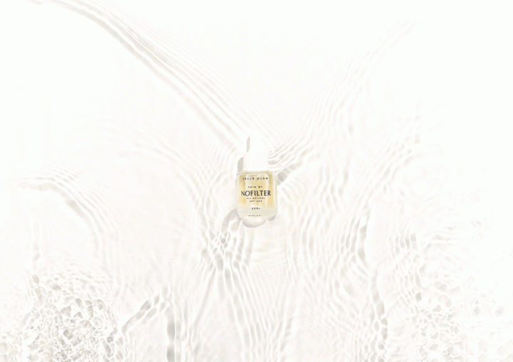
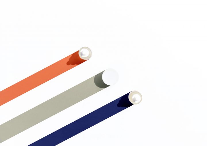
Creamy off-white, pale coral, washed out salmon, and ashy pastel green make up the warm and earthy colour tones. With all the elements combined, they collectively accentuate the modern yet classic, simple yet sophisticated ambience of the brand that work hand in hand with the packaging materials used for the brand essentials.
Photography by Hansen Salim
—
Our team is a collective of multi-disciplinary creatives specialising in creative direction, design & copywriting. With an emphasis on collaborative design, we strategically partner up with our creative friends who are dynamic developers, artists, & photographers to form an awesome band of creators.
Our foundation is laid upon partnerships and collaborations. We don’t work for you. We work with you. Your goals, are our goals. Your vision, is our mission.
