Matcha Cafe Bali
Cafe
Project Details
September 2017
Deliverables
Brand Identity & Development / Visual Identity & Art Direction / Brand Asset – Print & Digital
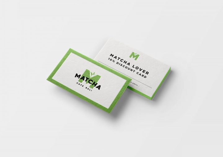
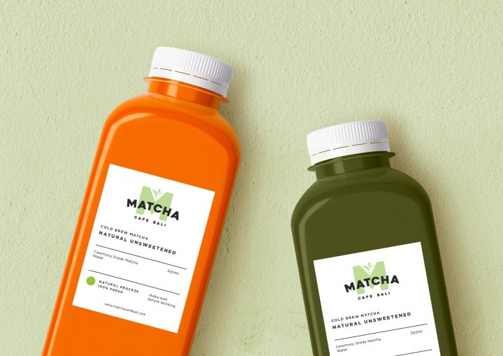
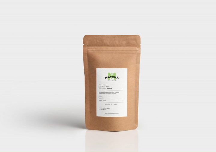
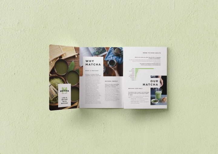
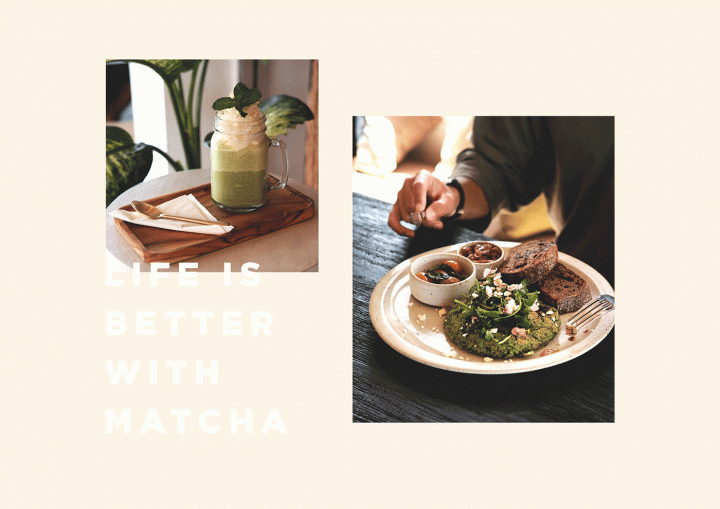
A full branding concept for a cafe in Bali. Matcha is well-known as a healthy beverage and pretty popular in Japan. But we are trying to make the brand looks more organic, modern, and young to make it suitable for the island style.
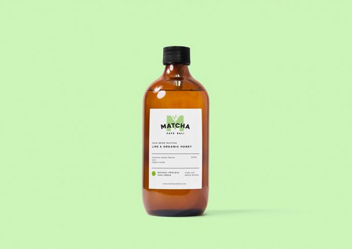
The brand wants people to understand that Matcha has a lot of good benefits that they don’t know. All of the dishes that they offer are 100% healthy, and organic. The idea is to understand our body better, and be good to mother earth in order to create a healthy life. We choose green as our main color as it shows life, organic and eco-friendly, also the pastel color brings more calming mood into it, and of course is the color of matcha it self.
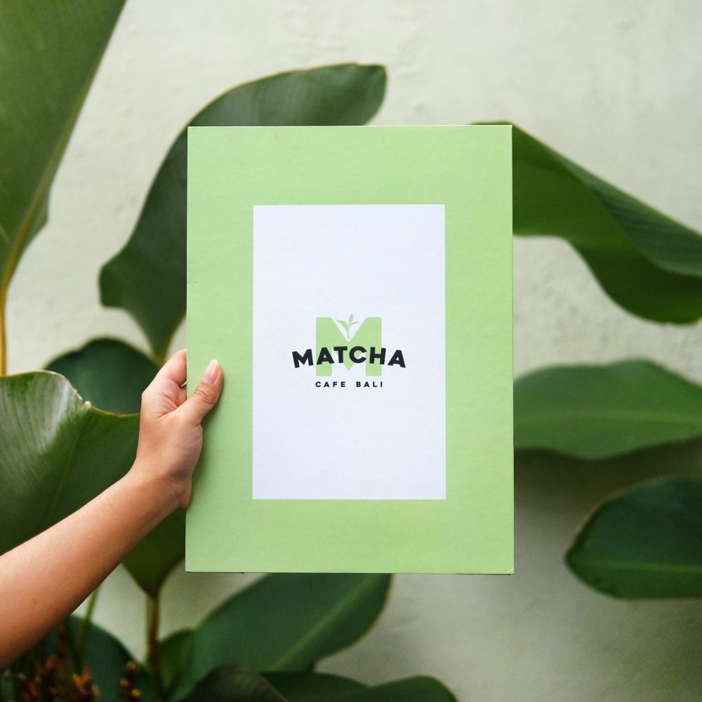
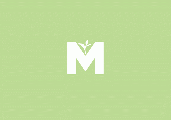
The logo is basically emphasising in the bold m and the tea leafs as the background of the brand name. the bold m represents the strength of benefits that matcha has. The form of “MATCHA” word’s curve as a bridge as it means progress, stability and connections which is suitable for the brand really well.
