Insight
Property
Project Details
November 2018
Deliverables
Visual Identity and Art Direction
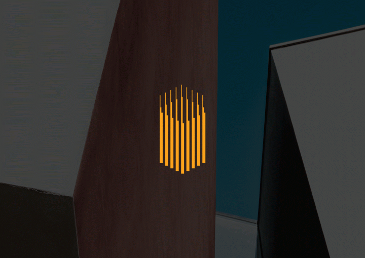
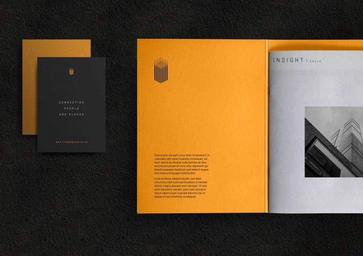
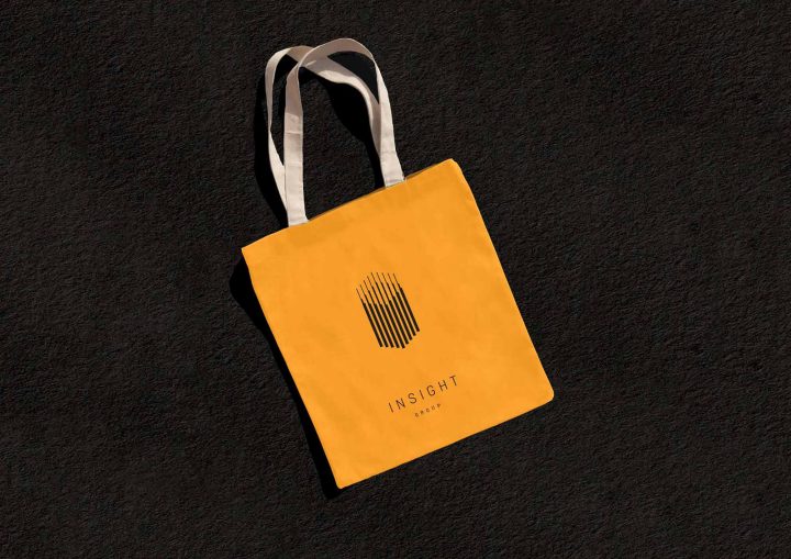
Insight’s logo retains a link to the industry with a logo that evokes visions of construction based on a strong and solid foundation, and symbolises growth towards the sky, and a work in progress – a company that is aspiring to great heights from a solid base.
We use a modern, slick and simple typeface to compliment the logo. The color palette is black, yellow, and white. But in applications, grey and off white can also be used as monochrome secondary colors, adding strength to the overall composition.
