OXO
Property
Project Details
February 2020
Deliverables
Creative & Art Direction / Brand Asset – Print & Digital
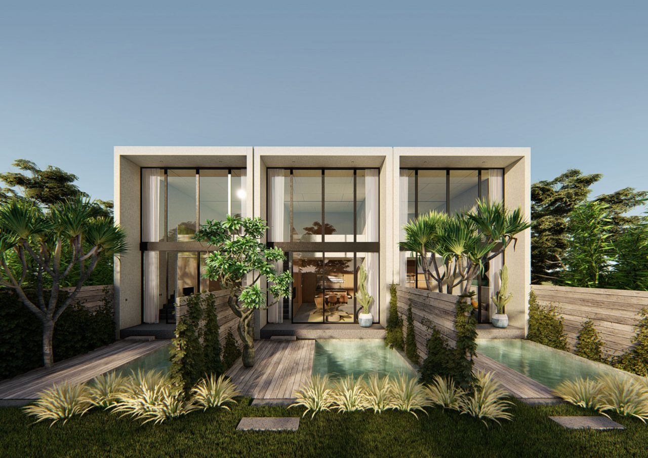
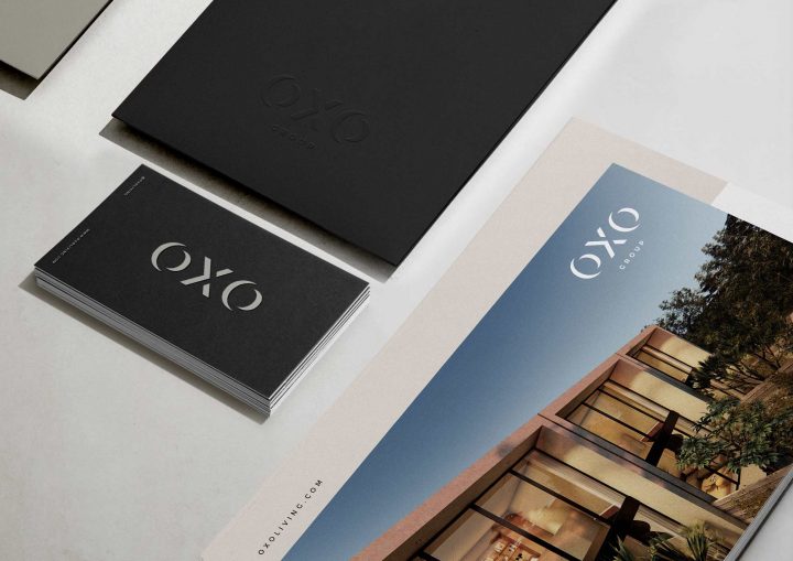
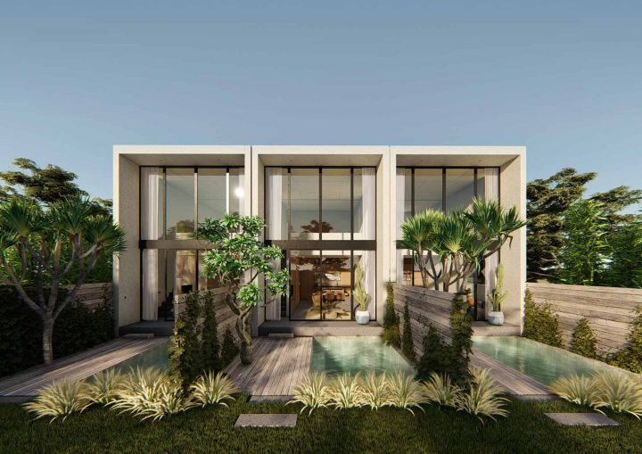
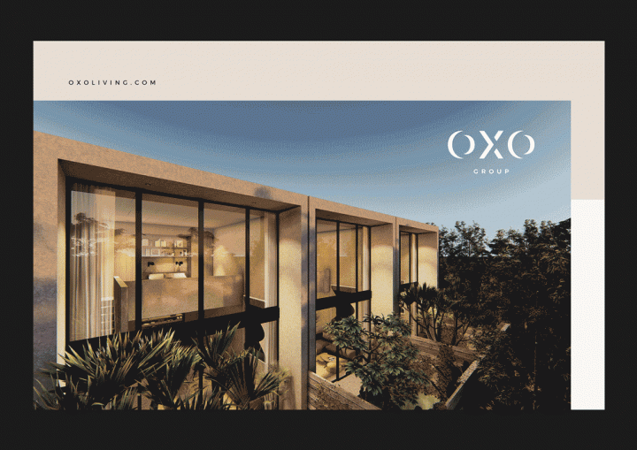
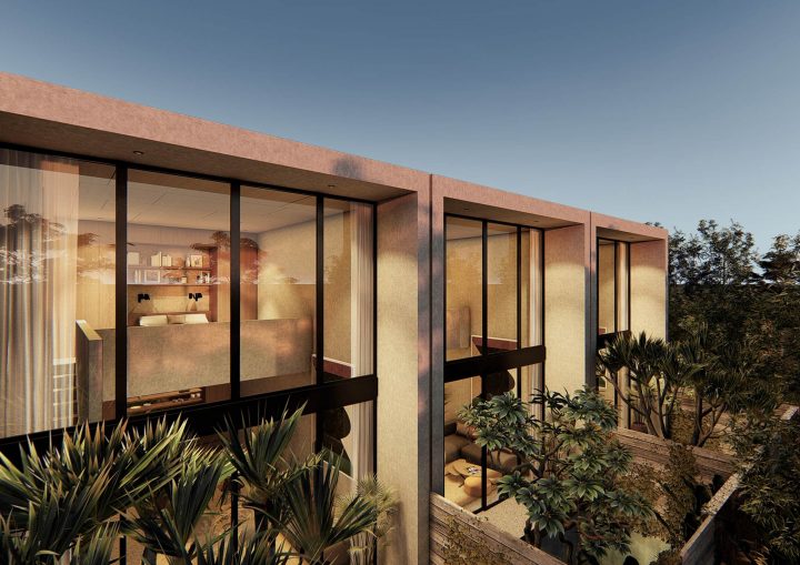
Oxo Living is not just another property developer. Founded on the premise of creating a better and smarter home with luxurious yet minimal architecture and interior. We sought to upend the generic by making OXO’s brand synonymous with convenience, innovation, and, above all, great design. Thus, we created a fully integrated branding that fully amplifies OXO’s brand essence.
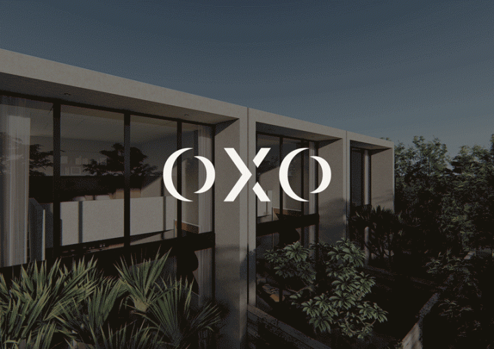
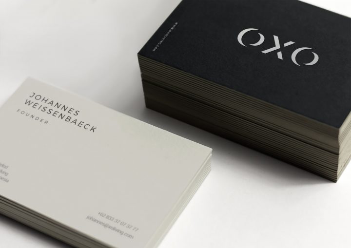
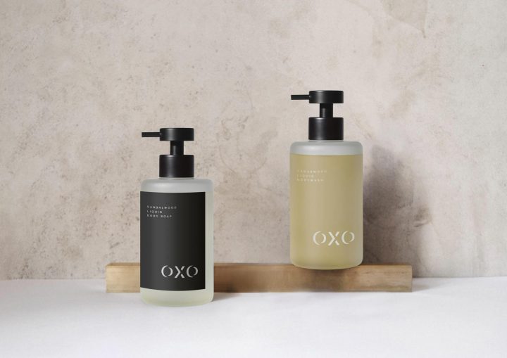
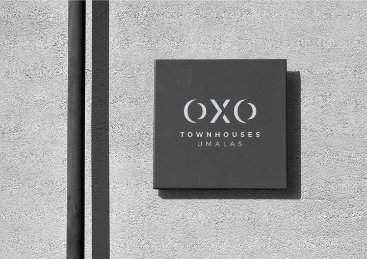
We creatively play with angles and depth in the main logotype to create an iconic look that resembles a sturdy concrete to represent solidity that is the very quality of OXO Living’s properties. The logotye is a custom san serif typography that has a strong & modern feel and to support the main logo, we use a modern san serif font and a less conservative, unique layout to give it an edge.
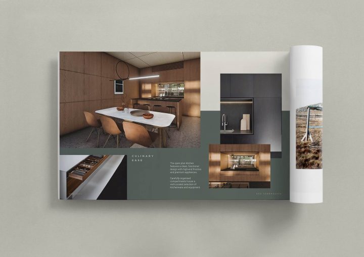
The mood that we are going for are premium & minimalistic, opulent yet humble. Additionally, earthy and sandy color tones with a dominant usage of black and greyish beige as the primary colors are our choice of palette to punctuate the warmth, luxury and timelessness of the brand.
