NIMBI
Restaurant
Project Details
April 2020
Brand Identity & Development / Visual Identity & Art Direction / Brand Asset – Print & Digital
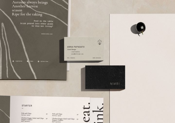
Nimbi is built on the premise of bringing people together over the endless bond over their love of food & social lifestyle. Believing that less is more, standing for elegance, subtlety, and natural sophistication.
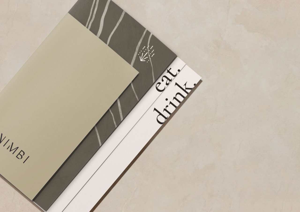
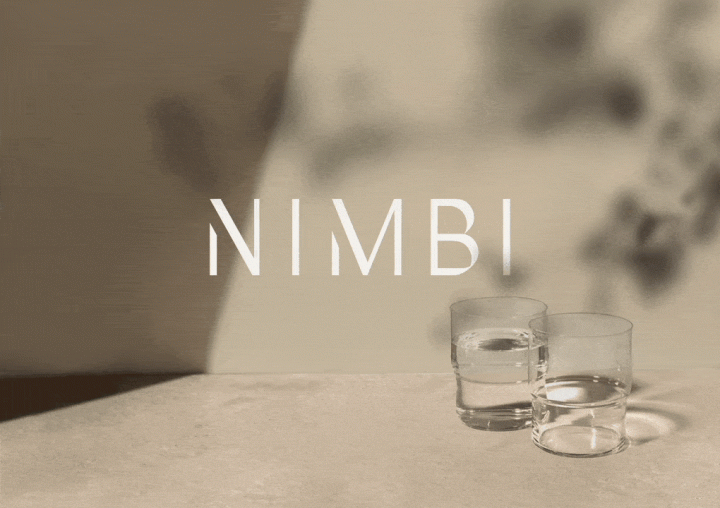
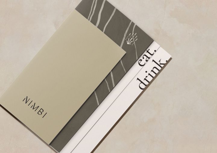
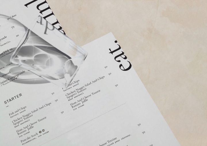
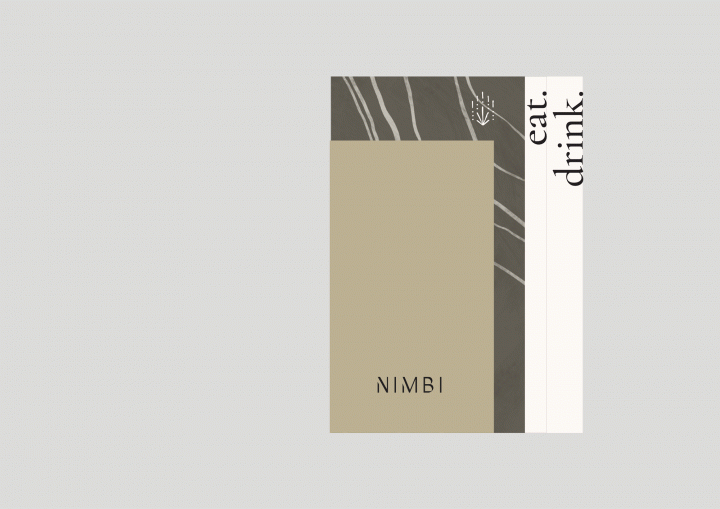
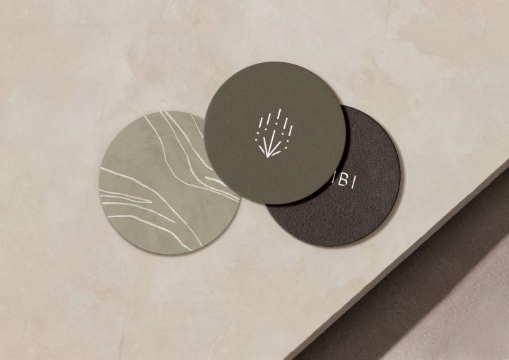
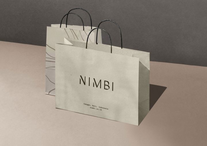
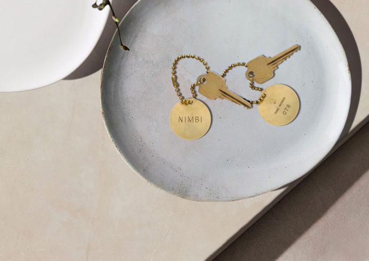
With these qualities in mind, a unique & meaningful brand identity was created that speaks softness and strength. This is achieved by playing with the forms & colours that together, hold both feminine & masculine qualities at the same time. The colour concept of soft earthy hues is connected to the idea of nature. Sand and mossy greens dominate while accents like brown, cream and light beige freshen things up and bring balance in. The visual approach that we are proposing to be integrated into the logo and overall branding theme is imaginative, figurative and visually poetic. This will tie beautifully together with the brand voice and language to be applied in brand communications.
